
| Home |
| News |
| Biography |
| Images |
| Sketchbook |
| Music |
| Words |
| Links |
Images
This is where you'll find photos (of me and by me), designs, sketches
and other artwork. Anything visual.
I've recently added a new page just for sketches from my sketchbook.
All artwork is © John Pierpoint, unless otherwise indicated.
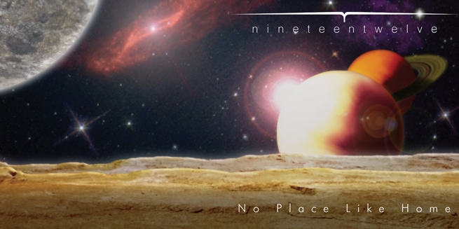
1912 No Place Like Home CD cover - digital, 2022
This began as a pencil drawing by Tanweer Dar, an artist and author and friend of the band. He produced an enhanced digital version which we wanted to use as the CD cover for the new album. I was originally just going to tweak it a bit to make it work better, but as time went on, more and more of the original art was replaced with new elements - especially once we realised that it should be a wrap-around cover, rather than a square image. Some of Tan's original elements remain (the two planets, the purple nebula), but all other elements were added by me. The rings were created in Illustrator. The galaxy is a stock image that I was originally going to use for Randolph Flagg's "Somewhere, Out There, Tonight. . ." album cover, but left off in the end. I rediscovered it when I came to do this one. The lens flare is classic Photoshop (I stacked three different flares and masked them). The nineteentwelve logo was desgned by Lee Potts for our previous album. We loved it so much we just had to use it again!
The planetary landscape and the moon are from photos I took of rocks in my garden!
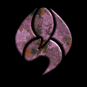
1912 logo - digital 2022
This is an early (but popular!) iteration of the new 1912 logo I created for the No Place Like Home album art (used on the booklet and the CD label). The texture is from a photo of lichen-covered stone that I took a few years ago, and used on 1912's "Elegy" album artwork. The band loved this so much that they had T-shirts made! Since then, I'm created dozens of other iterations, using other textures and effects.
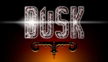
Dusk logo - digital c.2006
Dave Sutheran, drummer with Dusk, The Earthmovers, 1912 and Bogus Blooze, designed this logo and device about 1989. When we worked together to produce CDs of the Dusk material, I digitised it and applied textures and effects to create this image, which was used for a CD cover and the band's web site.
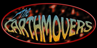
Earthmovers logo - digital
I created the original Earthmovers logo in Coreldraw, in the early 90s. We used it on T-shirts, banners and the newsletters that we'd hand out at shows. Later my partner Julie Hatton showed me how much better Photoshop was at creating stunning art. She created the "lava" texture and showed me how to generate 3D effects in the software.

Randolph Flagg logo - digital
This logo evolved over the course of three album designs from its original "old time", rustic, wooden aesthetic to this liquid gold with radiation version on space-themed cover to the band's final live album, "Somewhere, Out There, Tonight. . ."
Many of the following images are scans of artwork created a long time ago. They haven't yet been edited or cleaned up digitally (apart from some cropping), so in many cases, you can see the marks where the paper has been folded or pinned. I did a lot of work on the backs of old form paper, so you can sometimes see the table lines bleeding through on the scans.
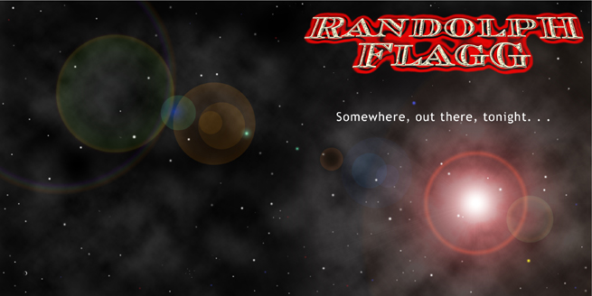
Randolph Flagg, "Somewhere, Out There, Tonight. . ." album cover, 2005
This was my design for the final Randolph Flagg album - a live offering.
It's all digital, done in Photoshop (you may recognise the lens flare!) amd InDesign.
I've removed the back cover text for this version.
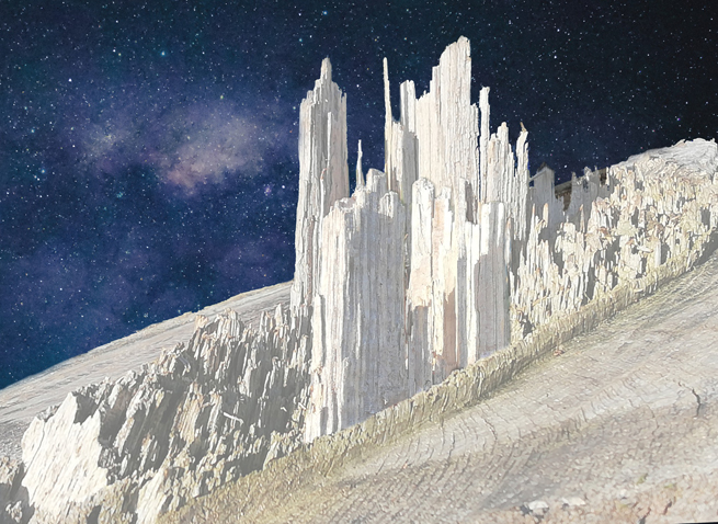
Cities In Flight - photo montage and digital, 2022
In 2022 we paid a visit to Dudmaston Hall in Shropshire.
On a walk around the grounds, I photographed the stump of a felled tree.
The felling process had left some shards of wood sticking up in the centre of the stump, and these had a great texture, so I took a few shots. I realised that the shards looked like crumbling skyscrapers, and the whole image reminded me of a Chris Foss cover for one of James Blish's "Cities In Flight" sci-fi novels.
So I made a composite image, using two of my tree stump photos, a NASA starfield image and a painted nebula. Some elements were overpainted digitally to improve the effect, and of course I played with colours and levels to give the wood that cold, white appearance.
Sadly, the original project file - along with all my original photos from the trip - was lost when a WD Blue SSD I'd recently fitted in my laptop failed completely and with no warning after just a couple of months. Luckily I'd shared this "work in progress" image as well as one of the original shots to Facebook, so I was at least able to recover JPGs of the image. Sadly, I also lost many images of my partner (who died a few months later) and son.
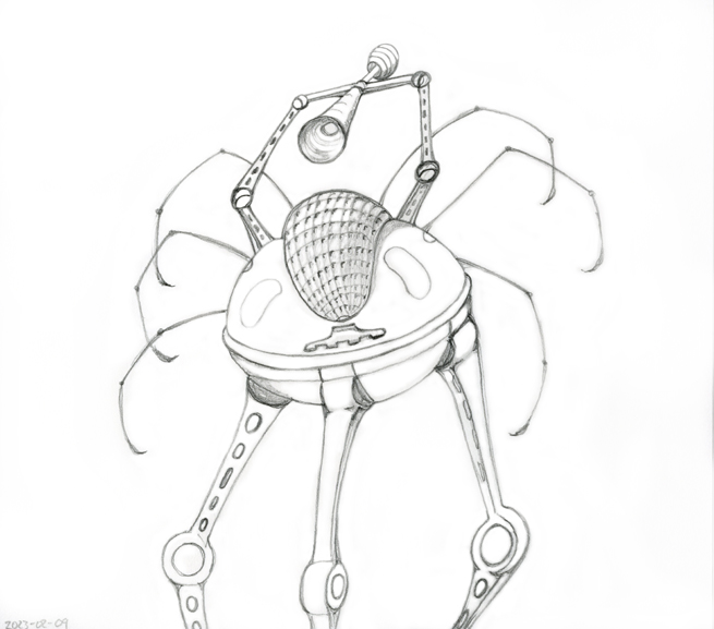
Martian Fighting Machine, 2023
Pencil sketch on an envelope.
It's hard to find an original angle on these oft-depicted machines. So many great designs have been produced over the years. I was determined to get the Heat-Ray right though - a trumpet-like device that was described as being lifted over the head of the machine. The "compound eye" doesn't quite work because it was drawn on such a small scale with a blunt pencil!
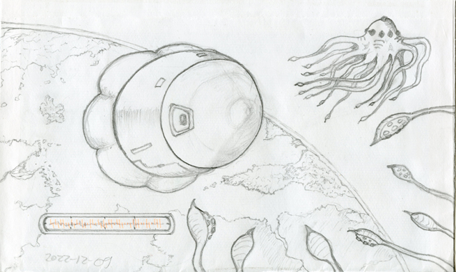
Sketch: Capsule and Aliens, 2022
Another envelope sketch. I even tried to incorporate the machine-readable code on the envelope into a "readout" display, as though the scene were being relayed by a camera. Like many sketches from this period, I just started with a random shape, then started working that shape into something (in this case, the capsule). The tentacled aliens were added later. The picture is now telling a story.
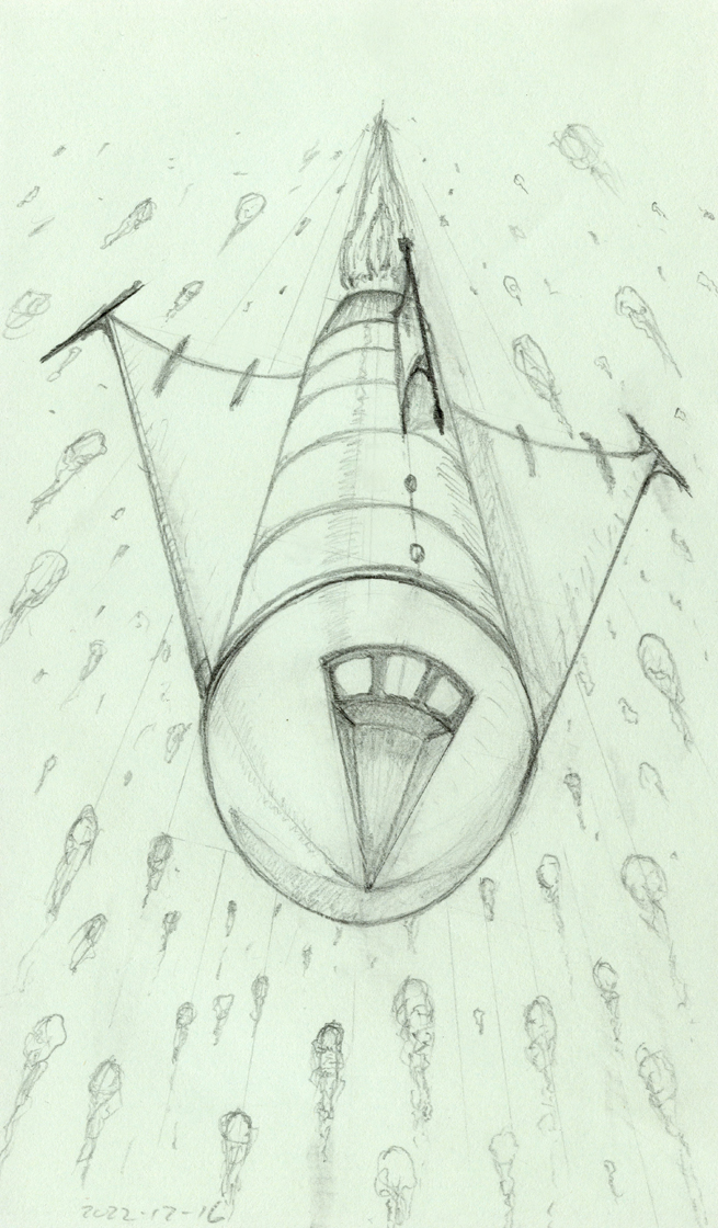
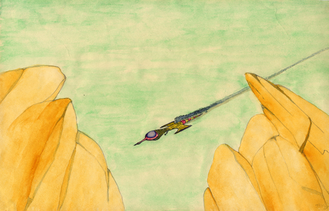
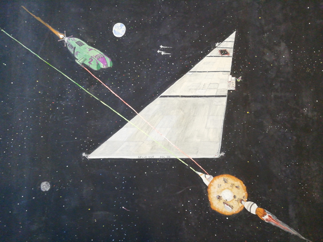
Spacecraft in Perspective
I just wanted to practice a perspective shot, and this is one of my favourite subjects.
I haven't even removed the construction lines (yet).
I like the dynamism and sense of danger in this scene.
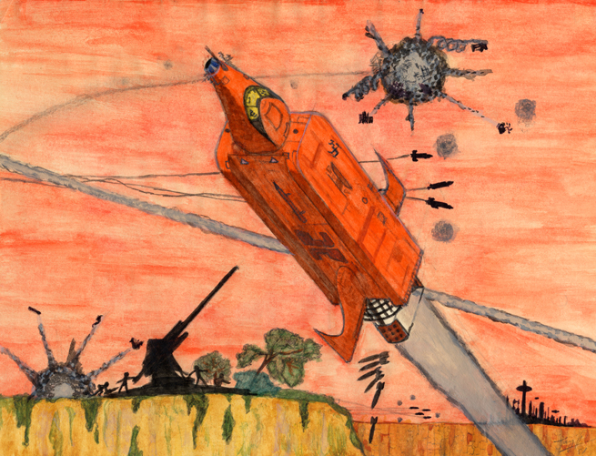
Aerial Attack - pencil, watercolour, enamel, 1981
I was inspired to paint this after seeing an atmospheric painting of a "Piranha" attack ship by Tony Roberts in Stewart Cowley's book "Spacecraft 2000 - 2100 AD" I wanted to do something similar in composition, although I made my vessel look a little different (the silhouettes in the background look more like those of Tony Roberts's original vessels though).
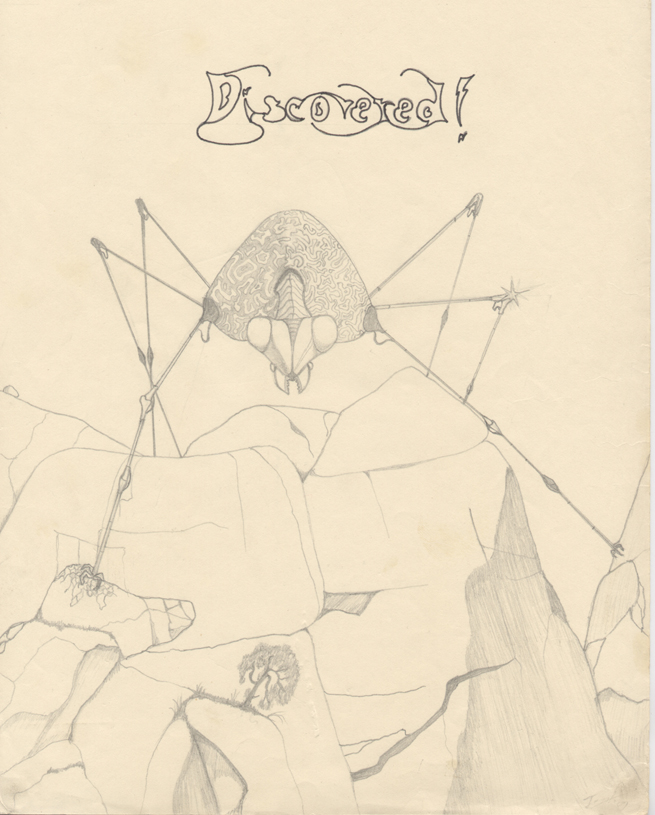
Discovered! - pencil, c. 1980
This image combines elements thaat I was really into at the time: the Martian fighting machines from the Jeff Wayne War of The Worlds album artwork, Roger Dean landscapes and calligraphy, trees. I imagine the tree as a last survivor, finally discovered by some destroying machine.
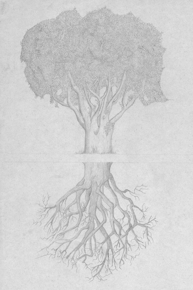
TreeMirror - pencil on paper. c.1980
I was fascinated by the idea of a tree's roots resembling a whole tree, but underground. Obviously a real root pattern wouldn't look like this (no trunk under the ground), but I wanted it to be like a playing card image that could be rotated: one side showing summer, the other showing winter.
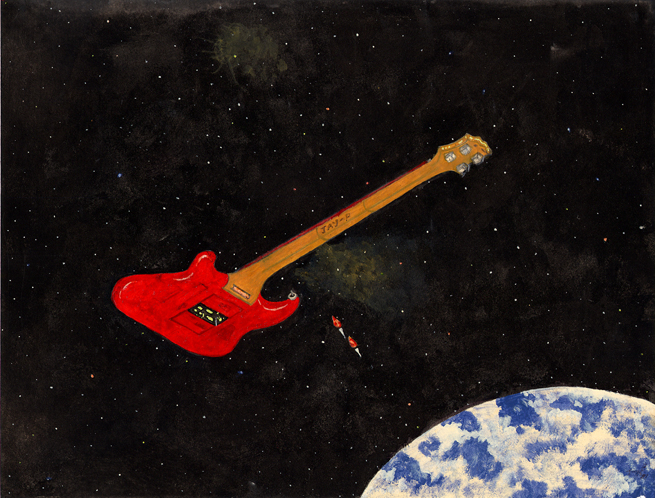
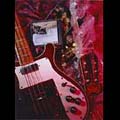
Epiphone Bass in Space - pencil, poster paint and enamel c.1981
This was my first ever bass guitar. Here I've pictured it as a spaceship (Boston-style!) with two plectrums about to dock.
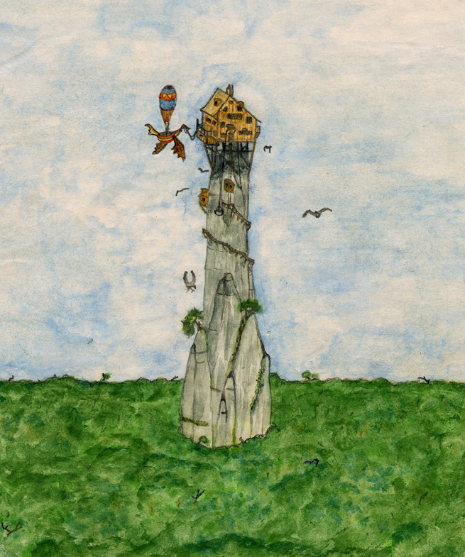
Airship and Tower - pencil, watercolour
From the early Eighties.
Heavily under the spell of Patrick Woodroffe at the time!
Crashdive - pencil, watercolour, enamel
From the early Eighties.
. . . also heavily under the spell of Roger Dean at the time!
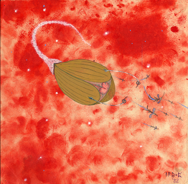
The Hunt - pencil, watercolour and enamel, 1982
Just a weird alien lifeform idea I was playing about with.
These are space-dwelling creatures, living in a gas nebula.
The large "hunter" uses decoys on stalks to lure the smaller creatures.
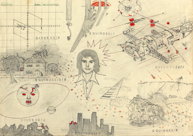
Jean_Michel Jarre montage - pencil and felt tip on coloured paper, 1979
This series of images tries to depict what I "saw" in my mind's eye whilst listening to the different sections of Jarre's first two albums, "Oxygene" and "Equinoxe". The text was applied using a John Bull printing kit!

Rik Emmet - pencil and watercolour, early Eighties
The pose is copied from a photo of the guitarist, as is the Triumph logo, but I added some Roger Dean elements in the top logo
and the "Topographic" background, then for some reason I added a large lizard and a rodent!
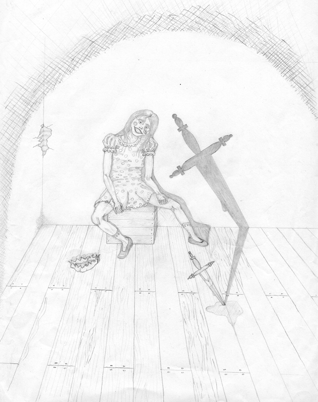
Sally - pencil, about 1988
This was
drawn to illustrate a song by Dusk that had a particularly powerful storyline:
all about a girl who kills her mother and runs away to join a puppet show!
In the song, the girl wants to be the Puppet Master's Queen, but is doomed to become a puppet.
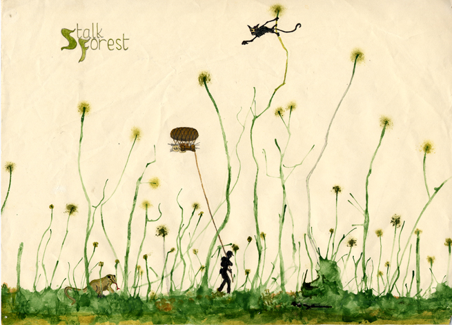
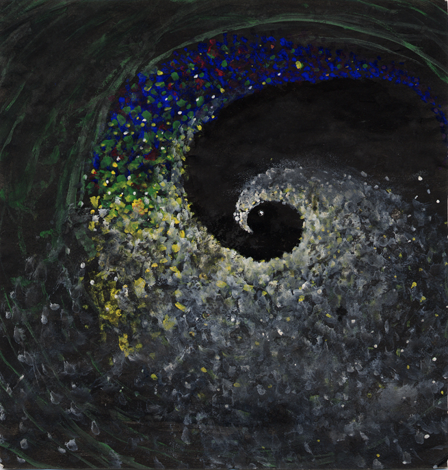
The Stalk Forest - Pencil, ink, watercolour, enamel
on paper, early Eighties
This started off with me playing with a classic "Tony Hart" type trick:
using a straw to blow blobs of watercolour across the page.
Once I'd decided that it looked like some kind of alien forest, I added the drawn and painted details.
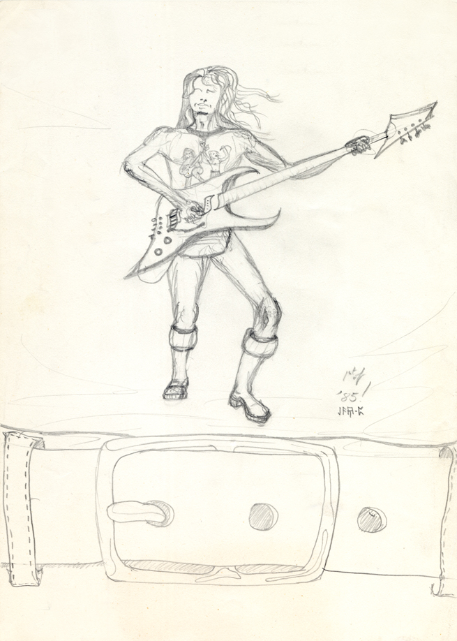
Bassist - pencil 1985
This is very influenced by the bizarre guitar designs found on Rodney Matthews' paintings. The bassist in this picture is shown as though on a T-shirt print (hence the belt-buckle).
The Tube - enamel and poster paint on paper,
early Eighties
I was inspired to paint this
after seeing the surf film Crystal Voyager on TV as a teenager.
The film's last section
was a montage of footage taken from cameras strapped to the nose of surf boards as they were ridden through the tubes of waves, all set to Pink Floyd's "Echoes".
It was a beautiful piece of film, and I wanted to catch the flavour of it in a painting.
Belle Vue - pencil, poster, enamel 1980
This was student art I created whilst at Solihull 6th Form College. I wanted to do a "Chris Foss" sci-fi scene, but hadn't really worked with paint much before, so it was a steep learning curve! The paper is larger than A2, so I can't scan it properly. This is one of a few photos I took of the art when I rediscovered it a few weeks ago. It had been rolled up for decades, so had to be stretched out onto a wooden board and stuck down before I could even photograph it. Various scuff marks show that it was not looked after in storage. The laser lines were painted using Humbrol dayglo colours!
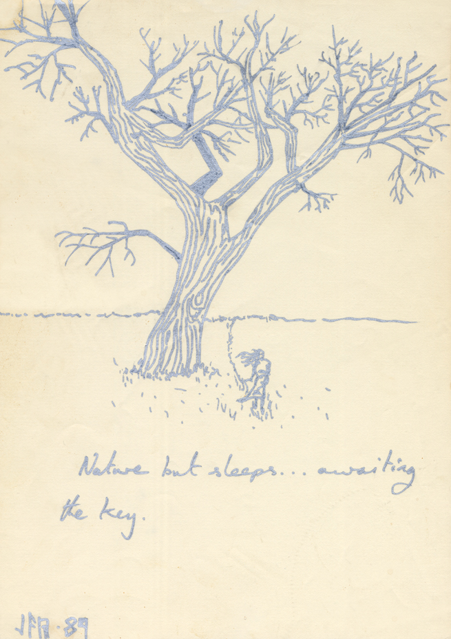
Nature but sleeps. . . silver felt pen, 1989
I love drawing trees. This one was done in a metallic felt pen. When I drew it I realised that it looked like it had a face with a wide, happy grin. So I drew a girl wandering past through long grass, as though the tree was awoken by her presence.
www.johnpierpoint.com
Site design by John Pierpoint
Older photos and initial design assist by Julie Hatton